
1ne s.p.a’s rebranding started in it’s 5th business year and with the encouragement of a 1ne s.p.a client who’s coached with me since the start.
The time arrived to differentiate and appropriately reposition my brand in the market. This meant aligning 1ne s.p.a’s visual representation of my values, vision and “personality” into the brand identity. The brand identity essentially symbolizes the foundation of what I represent in my clients’ business and to communicate my overall message.
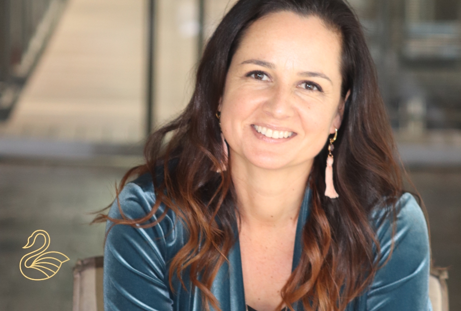
My new brand identity helps furthermore to build client loyalty and trust because it creates a connection between me, Helena, and the company.
Visual elements explained:
The point-up triangle represents a strong foundation and stability and this is what 1ne s.p.a Beauty & Business Coaching aims to build for their clients.
Triangles also have 3 sides and we know two are better than one, but a cord of three strands is not quickly broken. In this way you don’t have to do business alone in the beauty industry, allow 1ne s.p.a to join you as owner plus your team and together we make a team that is hard to break.
The swan is a symbol of love in motherhood, swans are fiercely protective of their babies and are phenomenal mothers. Having the courage to protect what we love is a great lesson from the swan. 1ne s.p.a comes with over 25 years of experience in Beauty & Business and is passionate about growing their clients, like the swan with courage, love and fierceness.
On a personal note, after school, I studied to become a professional ballet dancer at UCT and my dream was to dance the lead in Swan Lake. An injury cut that short, but that ballet and it’s music is still very close to my heart.
Further swans also bear message of love and relationships as they pair for many years and some are even sustained for a lifetime. My surname “van der Vyver” means by the swan lake, and I have been with my husband for almost 25 years, thus long term relationship between 1ne s.p.a and their clients is also very important to me.